Megatel Design System
Tokens, Components, Handoff — How I built the Megatel design system end-to-end, from token extraction and component inventory to state design and developer handoff.

Tokens, Components, Handoff — How I built the Megatel design system end-to-end, from token extraction and component inventory to state design and developer handoff.
01 — The Product
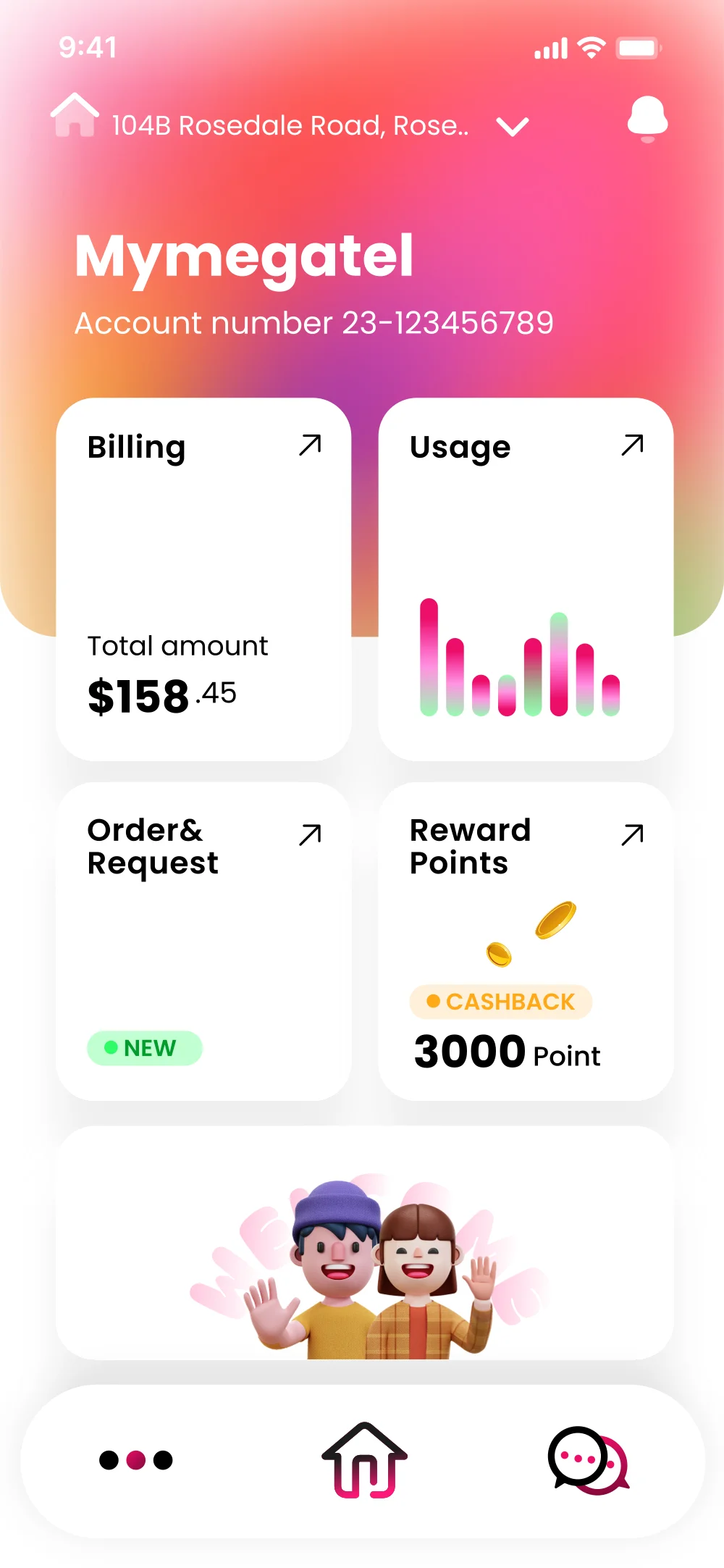
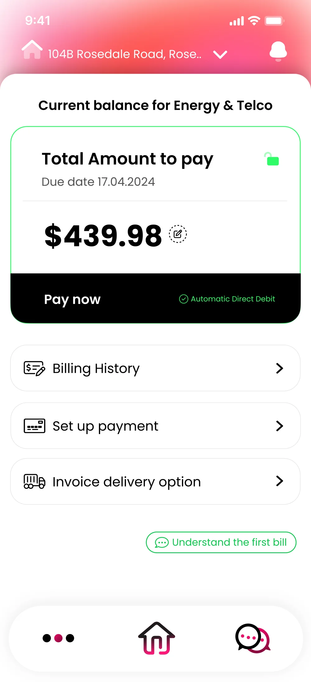
Mymegatel is a multiservice app combining energy and telco billing for NZ customers. Three core screens drove most of the interaction — the Dashboard, Billing, and Payment screens. Each needed to feel consistent, fast to scan, and easy to maintain as the product evolved.
02 — Design Tokens
Before building a single component, I audited all three screens and extracted every repeated value into tokens. A token is just a named variable — change one value, everything updates.
Figma — Mymegatel design variables and prototype screens (light / dark mode). Color tokens and styles panel on the right.
| Token Name | Value | Where Used |
|---|---|---|
| color/brand/primary | #EB0E69 | Bottom nav active, CTA buttons, gradient start |
| color/brand/gradient-end | #FF6B35 | Hero gradient, accent highlights |
| color/action/pay | #22C55E | Pay now CTA border, Automatic Debit badge |
| color/text/primary | #141414 | All headings, balance amounts |
| color/text/secondary | #888888 | Due dates, subtitles |
| color/bg/surface | #FFFFFF | All cards, list items |
| Token | Value | Used For |
|---|---|---|
| spacing/padding/card | 20px | All card inner padding (Billing, Dashboard cards) |
| spacing/padding/list-item | 16px × 20px | All list rows (payment options, navigation rows) |
| spacing/gap/section | 12px | Gap between list items and cards |
| radius/card | 20px | Dashboard cards, billing card |
| radius/list-item | 14px | Payment options rows, navigation list rows |
| radius/badge | 100px (full) | NEW badge, CTA buttons, "Pay now" bar |
Typography tokens define every text style in the app as a named variable. Font size, weight, line height — all stored as tokens so text styles stay consistent across every screen.
Why type tokens matter: The balance amount $439.98 uses type/display — 32px, weight 800. If the brand ever updates to a different font family, changing one token updates every balance, amount, and hero number across the entire app instantly.
03 — Components
After auditing the screens, I identified that almost every UI element is a variation of just three components. Build these three right, and you can assemble any screen in minutes.
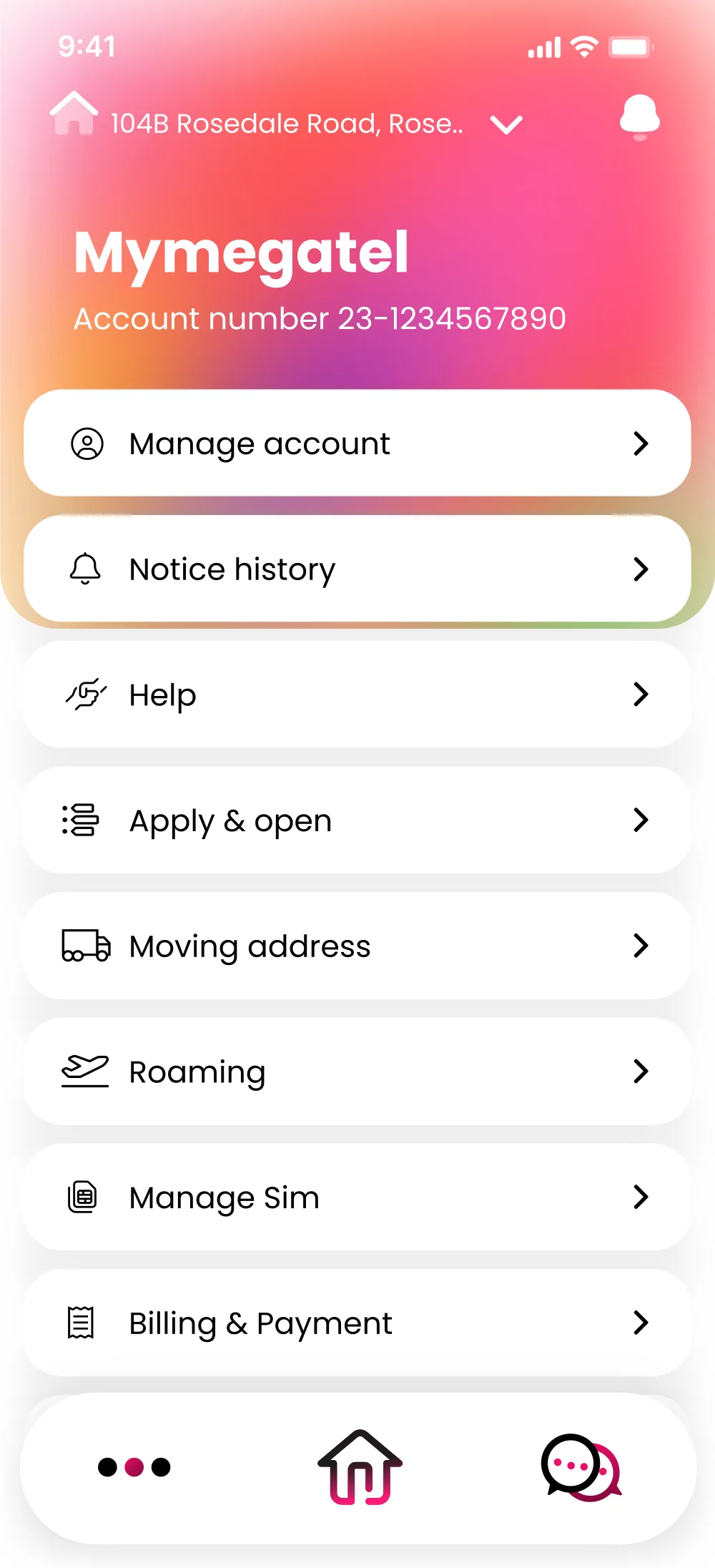
Every row in the payment list, the billing navigation rows (Billing History, Set up payment, Invoice delivery), and more are all the same ListItem component with different content slots.
Structure (Auto Layout — Horizontal):
[ Icon Slot ] + [ Label ] + [ Arrow Icon ]
Tokens applied: color/bg/surface, spacing/padding/list-item, radius/list-item
Variants: Internal (→) · External (↗) · No icon
States: Default · Hover · Pressed · Disabled
The 2×2 card grid on the home screen — Billing, Usage, Order & Request, Reward Points — are all instances of the same DashboardCard component. Each card has a title, an arrow, and a content slot that accepts any child (text, chart, image).
Structure (Auto Layout — Vertical):
[ Header Row: Title + ↗ Arrow ]
[ Content Slot — flexible height ]
[ Footer Slot — optional ]
Content slot variants: Amount text · Chart · Image · Badge
Total amount
$158.45
Cashback
3,000 pts
The prominent green-bordered card on the Billing screen. It always shows a balance amount, a due date, and a "Pay now" action. This component handles the most critical user action in the app. States: Unpaid · Paid · Overdue · Loading.
Structure: [ Header: Title + Status Badge ] → [ Amount Display ] → [ CTA Row: "Pay now" + Payment method ]
CTA row uses dark background for maximum contrast. The green border uses color/action/pay to signal "ready to pay."
Beyond the three main components, the app uses a consistent button and badge system across all CTAs. All buttons use radius/badge (100px) — pill shape is a Mymegatel brand signature.
Primary / Ghost / Disabled
Status Badges
04 — Component Inventory
A design system is only "full" when you can answer: what components exist, and where is each one used? Here's the complete inventory — 14 components across 3 categories, covering every screen in the app.
Balance display + Pay now CTA. States: Unpaid, Paid, Overdue, Loading.
Core2×2 grid tiles. Accepts any content slot: text, chart, image, badge.
CoreNavigation + payment rows. Variants: internal (›), external (↗), no icon.
CorePrimary, Secondary, Ghost, Destructive. Sizes: sm, md, lg. All states included.
SupportStatus indicators: NEW, OVERDUE, CASHBACK. Pill shape, 4 color variants.
SupportAddress selector + notification bell. Gradient background in hero variant.
Support3-tab navigation. Active state uses brand pink. Icons: More, Home, Chat.
SupportListItem variant with brand logo slot. External link arrow (↗) for 3rd-party.
SupportBar chart inside DashboardCard. Pink = energy, green = savings.
SupportTopBar + scroll area + BottomNav. Base frame all screens are built on.
LayoutPage title + back button row. Used on all sub-screens (Make Payment, etc).
LayoutVertical stack of ListItem rows with consistent gap/spacing tokens applied.
LayoutThe rule: If a UI element appears on more than one screen, it becomes a component. This inventory means any new screen can be assembled from existing pieces — no new component needed for 90% of new features.
05 — State Design
A component without its states isn't a component — it's a sketch. Designing every interactive and data state in Figma before development means developers never have to improvise a Disabled style or guess what a Loading screen should look like.
Default, Hover, Pressed, Loading, Disabled, Success CTA. Each state uses a specific token. Developers implement these from a single Figma reference.
The card looks completely different depending on whether the bill is unpaid, overdue, already paid, or loading — each state communicates urgency differently. Overdue uses the brand primary for the CTA bar so urgency overrides the standard hierarchy.
06 — Auto Layout
Auto Layout is the bridge between Figma and CSS Flexbox. When a component is built with Auto Layout, the Dev Mode panel generates correct spacing values automatically — no more guesswork from the developer's side.
ListItem row: Horizontal Auto Layout, padding 16px × 20px, gap 14px, Hug height.
Developer clicks the component in Dev Mode — Figma shows exact CSS: display:flex; padding:16px 20px; gap:14px;
Longer labels? The row stretches. Shorter? It shrinks. No hardcoded heights to break.
"What's the padding here?" → Nobody needs to ask. The answer is always in Figma.
Real example from this project: The Make Payment screen has 8 list items. With Auto Layout, adding WeChat Pay, Alipay, and Apple Pay was just dragging in 3 more instances. The developer implemented it with FlatList using the same spacing values — no spec sheet needed.
07 — Developer Handoff
Handoff isn't throwing a file over the fence. A good handoff means a developer can open Figma and answer every question themselves — without a single Slack message to the designer.
Every component in Dev Mode shows pixel-perfect spacing, font sizes, colors (with token names), border radius. All values link back to the token system.
The BillingCard has Unpaid, Paid, Overdue, and Loading states designed. Developers implement all states from a single reference — no assumptions needed.
The Billing screen includes annotations explaining the green border logic, the dark CTA row contrast rationale, and how the "Auto Direct Debit" badge appears conditionally.
Token names like color/action/pay match the variable names in the React Native codebase. No translation layer needed.
The payment flow — Billing → Make Payment → Confirmation — is fully prototyped so developers can see transitions and navigation logic before writing a line of code.
After development, I review the live app against Figma using an overlay tool. Spacing, radius, and color values are checked screen by screen before release.