Mymegatel App
Redesigning a utility management experience for New Zealand's senior expat community.
Overview
The Challenge
The MyMegatel app is the primary self-service platform for Megatel customers in New Zealand, managing electricity, gas, broadband, and mobile services in a single app. With a large Korean and Chinese-speaking senior segment, the app had grown complex and difficult to navigate, leading to high call centre volume and low self-service adoption.
0
Active users
0
Services in one app
0
Support tickets / month
0
Avoidable support calls
Navigation problems
- Multi-service screens scattered with no clear hierarchy
- Core actions (Billing, Usage, Orders, Rewards) buried 2–3 levels deep
- Users couldn't understand account status at a glance
User experience gaps
- Payment options didn't match Korean/Chinese customer preferences
- Usage data displayed in raw numbers with no contextual guidance
- No lightweight guidance for routine requests
Business impact
- High call centre volume for basic self-service tasks
- Low task completion rates for billing and payments
- Poor satisfaction among senior non-English speaking users
Design debt
- No unified design system across services
- Inconsistent terminology and UI patterns
- Text-heavy UI unsuitable for non-English speakers
Problem
Problem Statement
High Friction for Non-English Speakers
Data analysis revealed that 65% of active users were Korean and Chinese customers aged 55-70. Despite their experience with mobile apps in their native languages, the English-heavy interface of Mymegatel created a significant barrier.
Research Insight
I conducted user research with 50 users in total. The data showed that our primary user base struggled with basic app functions despite having years of experience with mobile technology in their native languages.
Language Barrier
Users feared making mistakes due to complex English instructions.
0 of support calls were for basic navigation help, averaging 0 calls/day.
Support Overload
The majority of support calls were for basic navigation help, overwhelming the team.
Users avoided the app or relied on support for simple tasks
Missed Payments
Confusing notifications led to a 0 increase in late payments among the older demographic.
0 increase in late payments among the older demographic
Research
User Research
I conducted user research with 50 users in total. Below are 6 representative insights: 2 from Google customer reviews, 2 from app customer reviews, 1 from the Marketing Team Lead, and 1 from the CX team.
I always worry about pressing the wrong button, so I just call support instead.
Why can't I use Alipay or WeChat Pay? I only use those and they're not available here.
I missed my payment last month because I didn't understand the notification. Now I'm scared to use the app on my own.
Using the app feels like homework. I only open it when I have to.
Our non-English-speaking senior segment is huge, but the app is English-first, so we're hitting a ceiling on conversion and retention.
Basic navigation and payment inquiries make up a large share of call centre volume. We need UX improvements so users can self-serve in the app.
Solutions
Design Solutions
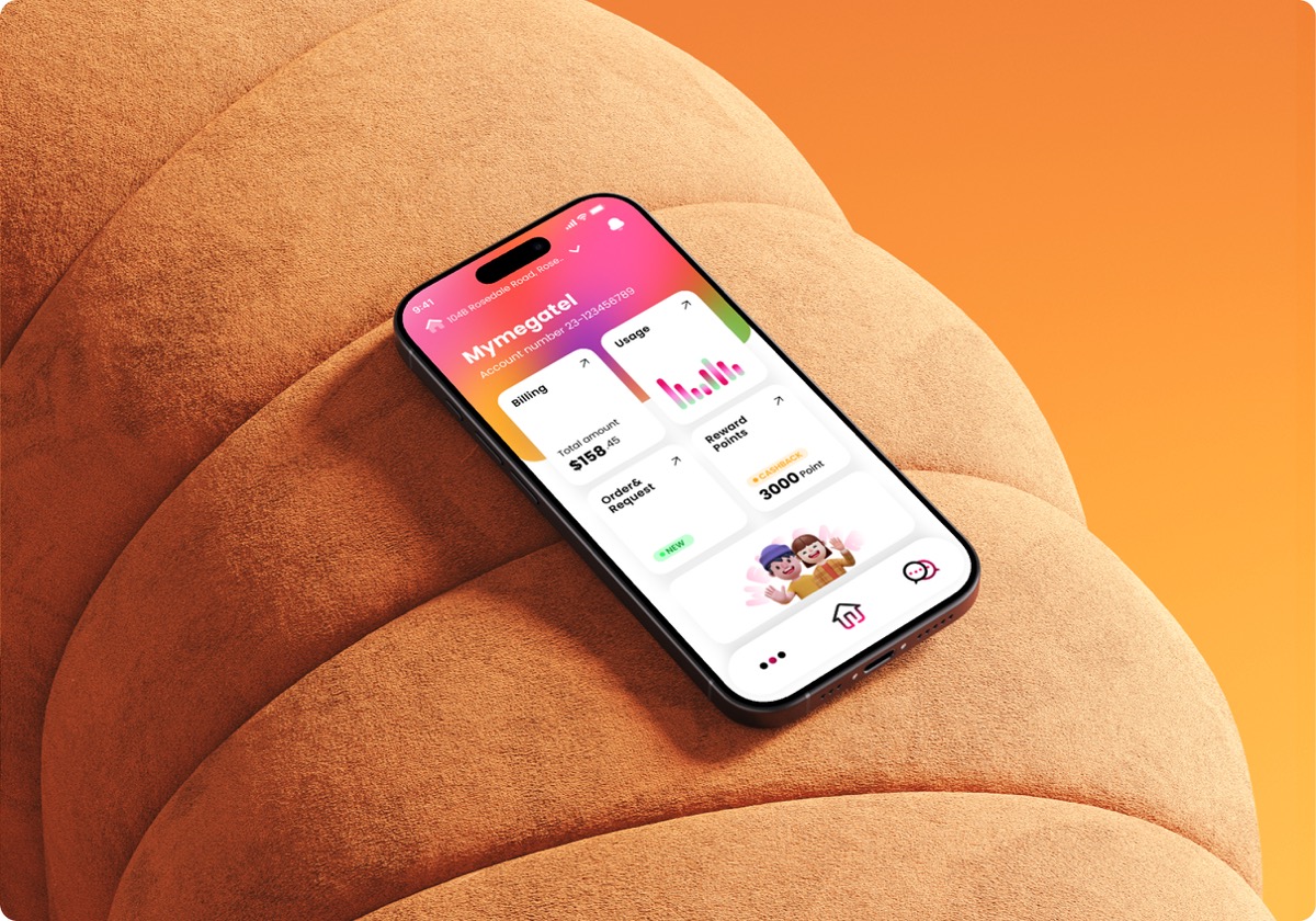
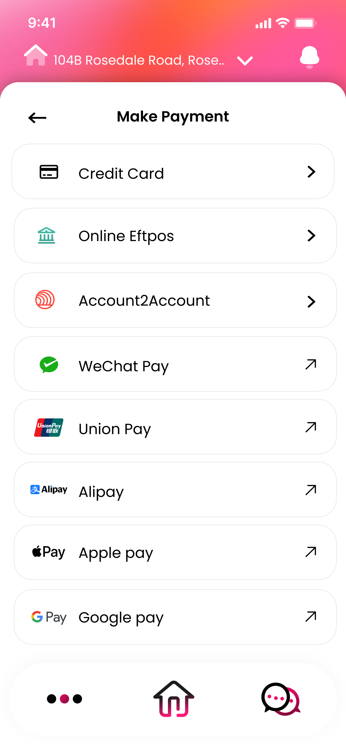
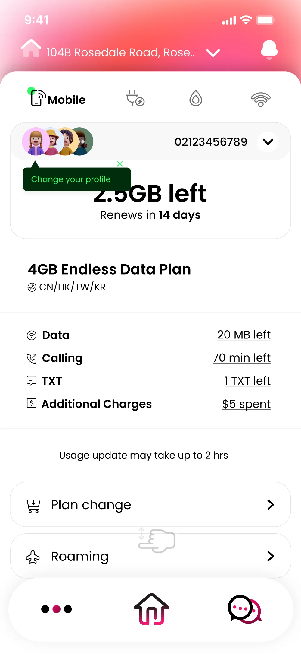
Text-Free Visual UI
I minimized text reliance by implementing clear iconography and micro-animations.
Result
Users can now identify "Bill Payment" and "Usage Check" instantly through visual cues, removing the need to read complex English terms.
Localized Payment Integration
I introduced familiar payment gateways: WeChat Pay and Kakao Pay.
Result
Leveraged existing user trust to increase auto-payment enrollment and reduce payment friction.
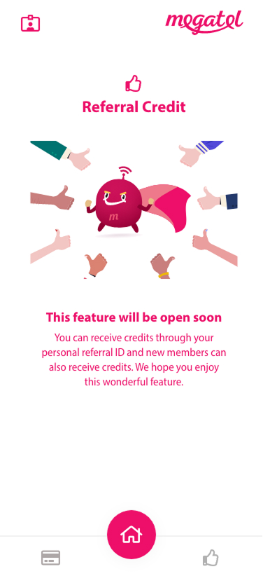
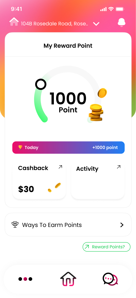
Hidden Credit Gamification
To counter the negative "homework" feeling, I added a hidden credit reward system.
Result
Transformed bill payment from a stressful obligation into a positive, rewarding habit.
1. Text-Free Visual UI
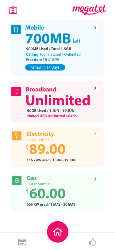 Before
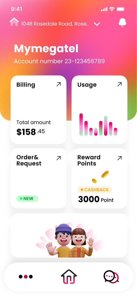 After
After
2. Localized Payment Integration
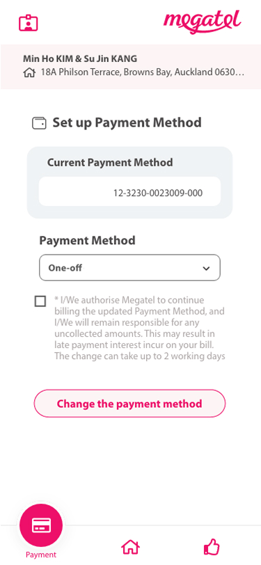 Before
 After
After
3. Hidden Credit Gamification
 Before
 After
After
Design System
Design System
Typography
Primary
Poppins
Headings — Clean & Modern
Secondary
Noto Sans CJK
Body — Optimized for multi-language legibility
Color Palette
Primary
#EB0E69
Secondary
#30FB67
Success
#10B981
Error
#EF4444
Background
#F9FAFB
Surface
#FFFFFF
Text Primary
#111827
Validation
A/B Testing
Validated the redesign with 25 internal testers over a 2-week period.
Variant A (New Visual UI)
WINNERNew visual UI with clear iconography and micro-animations.
Success Rate
0
Completed payments without assistance
Completion Time
0
"I didn't need to read anything."
Variant B (Original Text UI)
Original text-heavy interface with traditional menu navigation.
Success Rate
0
Struggled to understand status
Completion Time
0
"I got lost in the menus."
Business Impact
Customer support calls related to navigation
Between Feb 2024 and May 2024
Auto-payment enrollment rates
Tracked via Google Analytics
Users now visit the app not just to pay, but to check rewards
Increased engagement
Handoff
Developer Handoff
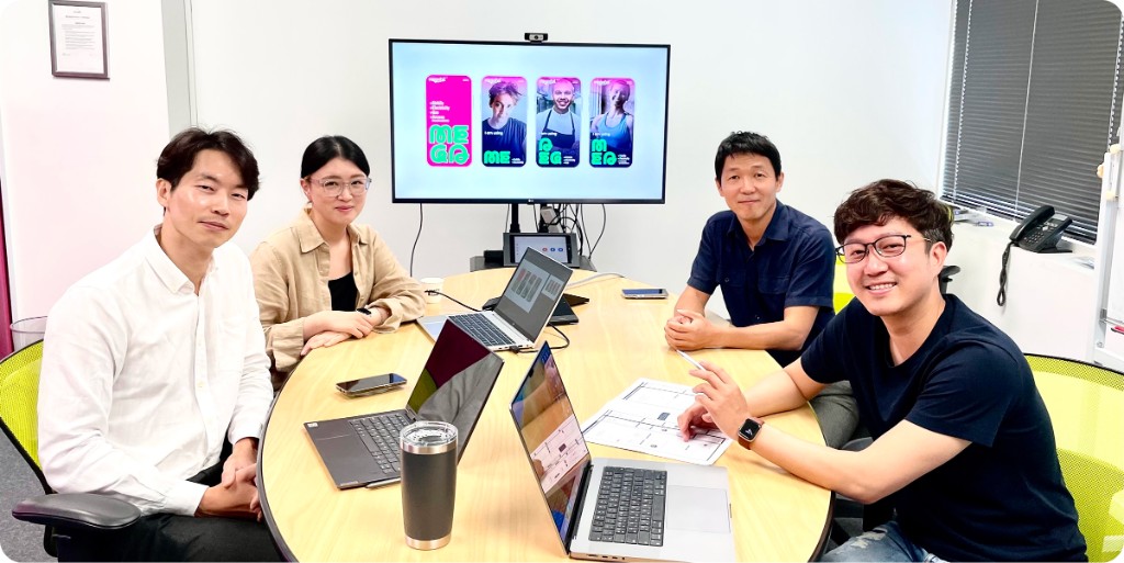
As the sole designer, I managed the entire lifecycle—from research to handoff.
Alignment
Presented research and A/B test results to stakeholders
Specs
Delivered a comprehensive component library and interaction guidelines in Figma
Collaboration
Maintained 95% design vision accuracy through weekly syncs with the development team
Tools Used
- Figma
- Lottie animation
Deliverables
- Interactive prototypes with micro-animations
- Component library with icon specifications
- Developer documentation with interaction guidelines
- A/B testing results and recommendations
Final
Final Designs
Screens
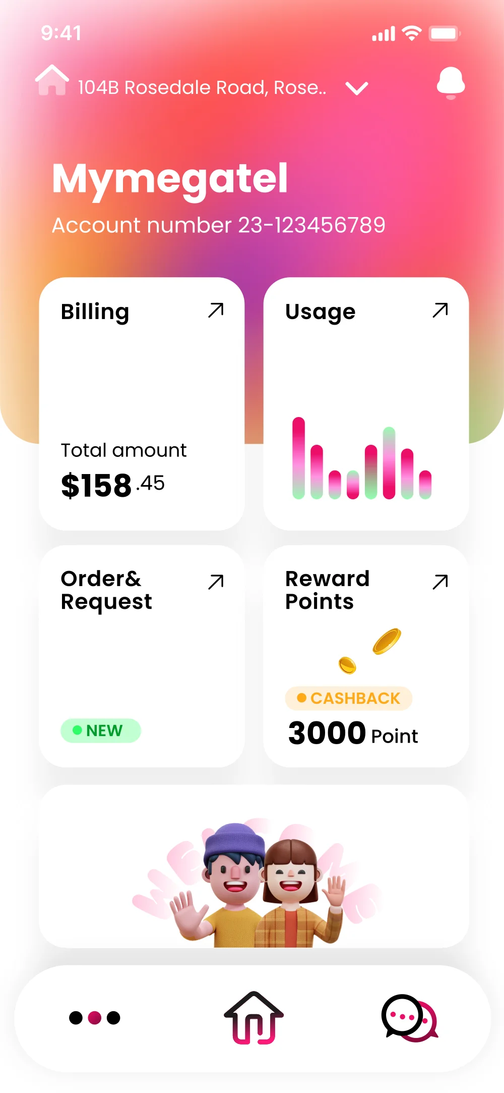 Dashboard
 Mobile Home
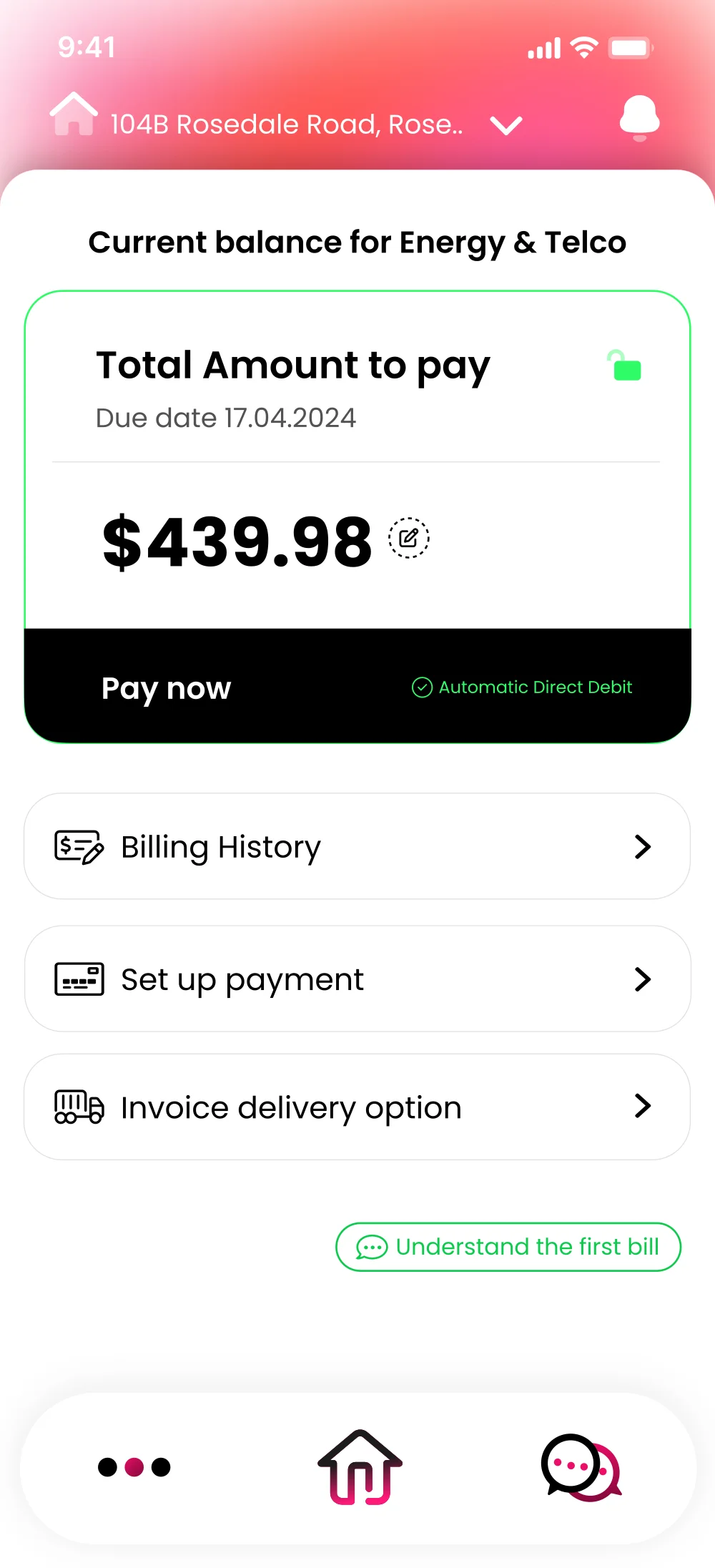 Billing
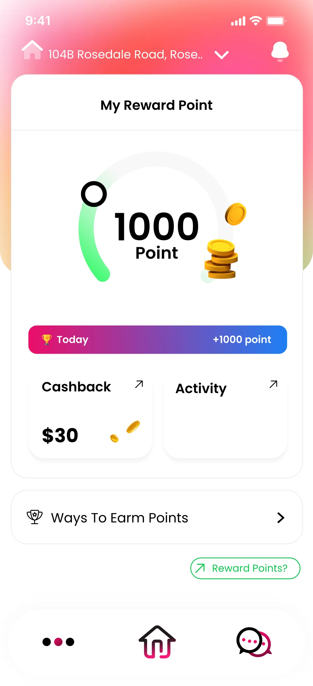 My Reward Point
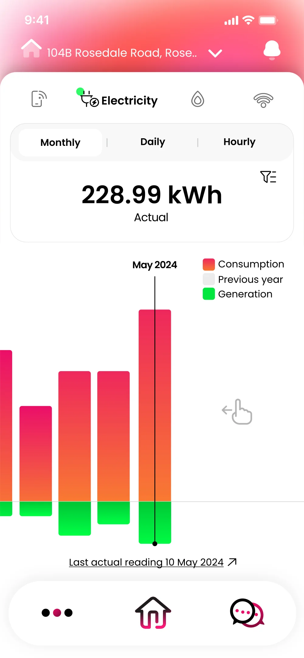 Electricity
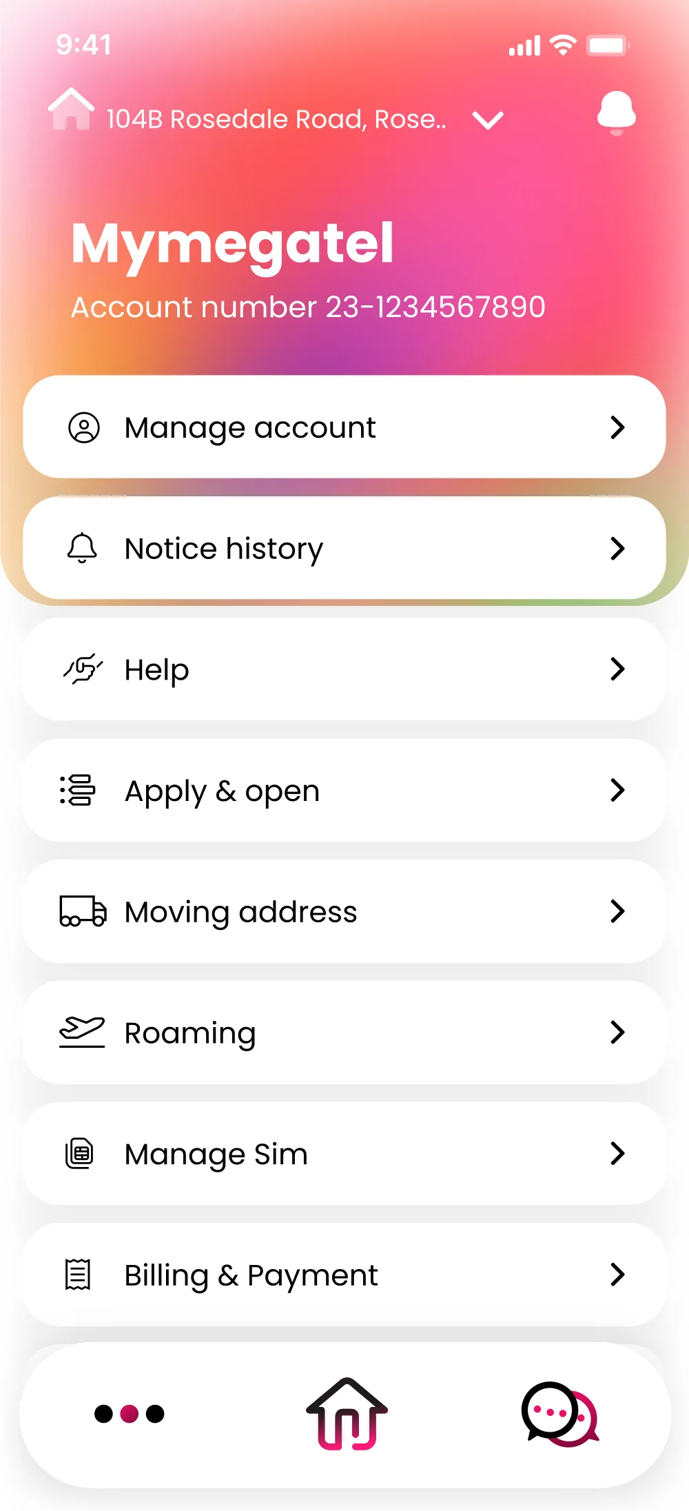 More
More